MYDS Logo

    MYDS

    Beta

    Carousel

    The Carousel component provides an interactive way to showcase features, content, or media in a horizontally scrollable list.

    Overview

    The Carousel component provides an interactive way to showcase features, content, or media in a horizontally scrollable list. It combines two parts:

    1. HorizontalCard → A horizontally scrollable container with left/right navigation arrows.
    2. FeaturesCarousel → A feature-specific implementation using HorizontalCard.tsx, which also supports opening a modal to show more details about each item.

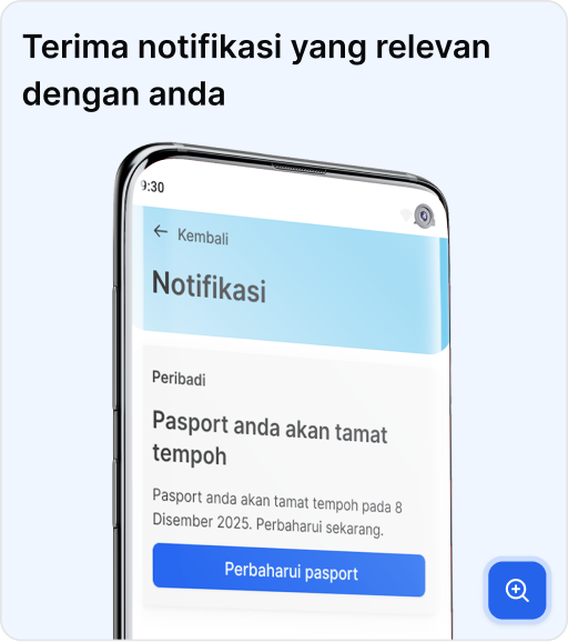
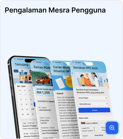
    This is useful when you want to display multiple features, showcasing product highlights and even creating media galleries with modal previews.

    Preview

    How It Works

    1. HorizontalCard

      • Provides a horizontally scrollable container for feature cards.
      • Each card is clickable and opens the modal when triggered.
    2. Dialog

      • Used to show the feature details in a modal view.
      • Contains DialogTrigger, DialogBody, DialogContent, and DialogClose.
    3. FeaturesCarousel

      • Wraps multiple feature cards inside HorizontalCard.
      • Each card is clickable and opens a modal (Dialog).
      • The modal displays a larger image and additional details.
    4. Features State

      • A useState hook tracks the currently selected feature (currentFeatureIndex).
    5. Feature Cards

      • Each feature has an image, title, description, and expanded view (open).

    Usage

    To use the Carousel in your project:

    1. Import the components
    import { useState } from "react";
    import HorizontalCard from "@/public/HorizontalCard";

    Also import the Dialog components:

    import {
      Dialog,
      DialogBody,
      DialogContent,
      DialogHeader,
      DialogTrigger,
      DialogFooter,
      DialogClose,
    } from "@govtechmy/myds-react/dialog";
    1. Prepare your data

    Each item should follow the Feature interface:

    interface Feature {
      id: number;
      title: string;
      desc: string;
      image: string;
      open: string;
      support?: string; // optional
    }
    1. Render the carousel

    Below is a simplified version of the FeaturesCarousel component you can copy and adapt:

    import { useState } from "react";
    import HorizontalCard from "./HorizontalCard";
    import {
      Dialog,
      DialogBody,
      DialogContent,
      DialogHeader,
      DialogTrigger,
      DialogFooter,
      DialogClose,
    } from "@govtechmy/myds-react/dialog";
     
    // Define the structure for your carousel items.
    interface Feature {
      id: number;
      title: string;
      desc: string;
      image: string; // The image for the carousel card
      open: string;  // The larger image for the modal
      support?: string;
    }
     
    export default function App() {
      // 📸 User Instructions:
      // 1. Replace the placeholder objects below with your own data.
      // 2. Add as many items as you need to the `features` array.
      // 3. For 'image' and 'open', provide the path to your image files.
      //    The 'image' is for the small carousel card, and 'open' is for the larger pop-up.
     
      const features: Feature[] = [
        {
          id: 1,
          image: "/public/your_card_image.png",
          title: "Your First Image Title",
          open: "/public/your_modal_image.png",
          desc: "This is a brief description of the first image.",
        },
        {
          id: 2,
          image: "/public/your_card_image_2.png",
          title: "Your Second Image Title",
          open: "/public/your_modal_image_2.png",
          desc: "This is a brief description of the second image.",
        },
        // Add more items here following the same structure.
      ];
     
      // State to manage which feature's content is shown in the modal.
      const [currentFeatureIndex, setCurrentFeatureIndex] = useState(0);
     
      return (
        <div className="mx-auto max-w-[1328px] border-x border-[#F4F4F5] sm:px-[18px] md:px-[24px]">
          <section className="flex justify-center px-[18px] py-12">
            <div className="w-full">
              <Dialog>
                <HorizontalCard>
                  {features.map((feature, index) => (
                    <DialogTrigger key={feature.id}>
                      <div
                        className="relative flex-shrink-0 px-2 cursor-pointer"
                        style={{ width: "334px", height: "354px" }}
                        onClick={() => setCurrentFeatureIndex(index)}
                      >
                        {/* Card Container: Fixed size with overflow hidden */}
                        <div className="h-full w-full rounded-2xl shadow-2xl overflow-hidden border">
                          {/* How Images Fit:
                          1. object-cover = class ensures your images (no matter their original size) will fill the container completely without distortion. 
                                            Excess parts of the image will be automatically cropped.
                          2. object-contain = This class scales the image down so that it fits entirely within the container, preserving its aspect ratio. 
                                              It will not crop the image, but it may leave empty space (letterboxing) if the image's aspect ratio does not match the container's. 
                          */}
                          <img
                            src={feature.image}
                            alt={feature.title}
                            className="w-full h-full"  // The images will fit in the card (if the image is too big, the image will be compacted)
                          />
                        </div>
                      </div>
                    </DialogTrigger>
                  ))}
                </HorizontalCard>
     
                {/* Modal Body: This is the pop-up that appears when a card is clicked */}
                <DialogBody className="w-full md:!max-w-[800px]">
                  <DialogClose>
                    <button
                      className="absolute right-4 top-4 rounded-lg border border-[#E4E4E7] p-1.5 text-gray-500 hover:text-gray-800"
                      aria-label="Close modal"
                    >
                      <svg
                        xmlns="http://www.w3.org/2000/svg"
                        className="h-6 w-6"
                        fill="none"
                        viewBox="0 0 24 24"
                        stroke="currentColor"
                      >
                        <path
                          strokeLinecap="round"
                          strokeLinejoin="round"
                          strokeWidth={2}
                          d="M6 18L18 6M6 6l12 12"
                        />
                      </svg>
                    </button>
                  </DialogClose>
                  <DialogHeader className="pb-0" />
                  <DialogContent>
                    <div className="flex flex-col items-center gap-8 md:flex-row justify-center">
                      {/* Modal Image: Uses the 'open' image path from your data */}
                      <img
                        src={features[currentFeatureIndex].open}
                        alt={features[currentFeatureIndex].title}
                        width={222}
                        height={275}
                      />
                      <div>
                        <h2 className="mb-4 text-base font-semibold">
                          {features[currentFeatureIndex].title}
                        </h2>
                        <p className="max-w-sm">
                          {features[currentFeatureIndex].desc}
                        </p>
                      </div>
                    </div>
                  </DialogContent>
                  <DialogFooter className="pt-0" />
                </DialogBody>
              </Dialog>
            </div>
          </section>
        </div>
      );
    }
    1. Customize Content
      • Replace features array with your own data.
      • Adjust styling inside HorizontalCard or FeaturesCarousel if needed.
      • Optional: add more controls or customize modal layout.

    Best for: Showcasing features, services, or image galleries in a compact scrollable view, with modal support for expanded content.
    On this page